Fractal Market Hypothesis - How To Quantify Extreme And Long-Term Persistent Events In Finance
- Adaptive Alph

- May 2, 2020
- 12 min read
Updated: May 3, 2020
EconoPhysics
The objective for a physicist when creating a mathematical model is to quantitatively explain the behavior of a natural phenomenon for either practical purposes or out of pure academic curiosity. Over time, physicists have successfully developed models answering fundamental questions explaining our existence. Due to the immense success of physics, economic and financial modeling emerged as a sub-field in the early 1900s with a purpose to explain behavior of the market rather than nature. The goal for modern economists and financial analysts varies from making money to creating a safer market, helping governments establish proper market regulations and satisfying curious minds. Just like physicists stopped viewing science as deterministic by realizing that not everything could be understood in the quantum world, economists have realized that achieving full employment is a utopia and financial strategists, the good ones at least, understand their limits when recommending stocks to their clients. The view that the market is closer to a black box than a deterministic garden of eve does not prevent economists from trying to achieve full employment and neither hinders financial analysts from helping their clients achieve a great retirement portfolio. To the contrary, being realistic about limitations enhances the ability to plan for the future in order to create robust job markets and more anti-fragile investment portfolios. Modern finance views the market closer to a garden of eve, while Mandelbrot views that market more as a black box. As an out of the box thinker, Mandelbrot provides ideas that both complements and challenges orthodox economic theory. He provides evidence for why tail risk follows power rather than Gaussian laws and with his fractal market hypothesis theory he provides an alternative view on the behavior of markets.

Benoit Mandelbrot, he saw patterns where others saw randomness
Mandelbrot And The Mystery Of Cotton
Before diving into Benoit Mandelbrot’s financial research, we will first investigate the man himself. Like most other Poles born in the 1920s, his early life was heavily impacted by WW2. In 1936, his family moved to France where he ended up studying mathematics at the famous Ecole Polytechnique University. After graduating from Cal Tech in the U.S with a Masters in Aeronautics, he returned to France for a PhD in mathematics at University of Paris. This was also where he began a career in research and as a polymath he worked on problems within mathematics, information theory, and fluid dynamics. Mandelbrot’s introduction to finance came while working on income distributions at IBM in the 1960s where his edge was IBM’s advanced computers. His wealth research at IBM intrigued economists around world and resulted in an invitation to present by Professor Houthakker at Harvard University. While preparing for the presentation about his findings on income distribution in a Harvard classroom, Mandelbrot noted that someone had forgotten to erase a convex v-shaped graph on the blackboard showing a similar pattern to income distribution. That diagram happened to display the price of cotton, which the New York Cotton Exchange had kept exact daily prices records of for more than a century. As almost a mad scientist, Mandelbrot wanted to find out if a deeper relationship between the price of cotton and the income distribution existed.

Louis Bachelier - Influenced orthodox financial theories
The Father Of Modern Finance
Prior to disclosing Mandelbrot’s financial parallels between the income and cotton price distribution, we must first introduce the brave man responsible for modern finance. That brave man’s name is Louis Bachelier and he shaped the future of orthodox financial theories in the beginning of the 20th century by using a combination of probability theory and Gaussian statistics as foundation for his research. According to Mandelbrot, Bachelier was the first person to bring statistical modeling into finance as Bachelier’s PhD thesis involved analyzing the movement of French Bond prices through a comparison of its price swings with how heat diffuses through an object. Heat diffusion and bond price dispersal are both complicated stochastic processes, as analyzing all relevant factors impacting how energy particles and the bond prices move is nearly impossible. To simplify the analysis, he viewed the market as a fair game similar to a coin flip. Just like the coin has a 50% chance of landing on heads, the French bond price has a 50% probability of going up or down on any given trading day if price moves are independent and no new information is added. Bachelier therefore concluded that French bond prices follow a random walk fluctuating around its average price. In fact, he showed that a month’s worth of bond prices printed on a graph would spread out just like the famous bell curve as predicted by the Gaussian normal distribution. By being able to use Gaussian assumptions such as price independence, stationarity and normal distribution, he could apply heat diffusion equations on financial data. His forecasts were successful as he almost perfectly identified the probability of profiting from call options and he therefore concluded that the market obey the laws of probability. However, Mandelbrot believed that Gaussian assumptions were imperfect and suggested that life is more complex. Mandelbrot’s research demonstrates that price dependence exists, extreme events occur more often than Gaussian theory suggests and asset price time series’ are not stationary.
Figure 1
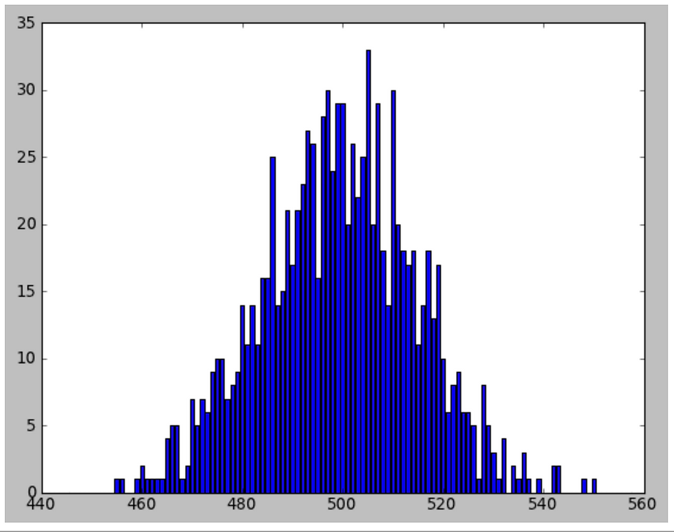
This distribution represents a 1000 trials of a 1000 coin tosses with number of heads on the x-axis and total heads given each trial on the y-axis. The distribution is bell shaped and centered around 500, which is predicted by the Gaussian normal distribution. http://pi3.sites.sheffield.ac.uk/tutorials/week-9
Back To Cotton Prices - Plus Power Law, Income And Meaning Of α
Thanks to Mandelbrot’s position at IBM, he was one of the first economists monitoring economic data using advanced computers. In his 1962 cotton analysis, he could therefore study more than 100 years of daily, monthly and yearly price moves without problems. For Houthakker, the constantly changing volatility of those price moves made the analysis of the cotton time series unfit for the Gaussian Bachelier model. To improve upon the findings of Houthakker, Mandelbrot’s approach involved combining power laws and the mathematics of stable distributions. The former is a common pattern in science. For example, the number of earthquakes varies by a power law with their intensity as small quakes are common and big ones are infrequent. Power laws are also common patterns in finance and Mandelbrot labeled such patterns fractal scaling because they are time invariant. To understand the power law of a time series, one should draw the power relationship on graphing paper using log scales such as 1,10,100 instead of numbering the axis using a regular scale such as 1,2,3. For example, as we learned from junior algebra, there is a clear relationship between the area and the side of a chessboard square. The area is the length of the side raised by the power of 2. In a log-log graph format as in Figure 2, the area to side relationship turns out to be a straight line as the area of a square with length 2 is 4, 3 is 9 and 4 is 16. The slope of that straight line in a log-log graph is therefore going to be 2, which is precisely equal to the length raised by the power of 2. The linearity observation is extremely awesome because it is then possible to detect a power law distribution if one plots unknown observations of a time series in a log-log format. With wealth, Pareto stated that all income distributions follow approximately a 3/2 alpha (α) power law. This means that one can calculate the probability of anyone’s place on the income distribution curve. For example, if minimum wage is USD 15 per hour and the average workweek is 40 hours, the annual salary is about USD 32,000 per year. The percentage of people making approximately 100 times USD 32,000 is then (1/ 100)^1.5, which is around 0.1%. A 1000 times minimum wage is then around 0.003%. With fractal geometry there is a limitless range of powers for different types of time series and later you will see that there is a different value of α.
Figure 2
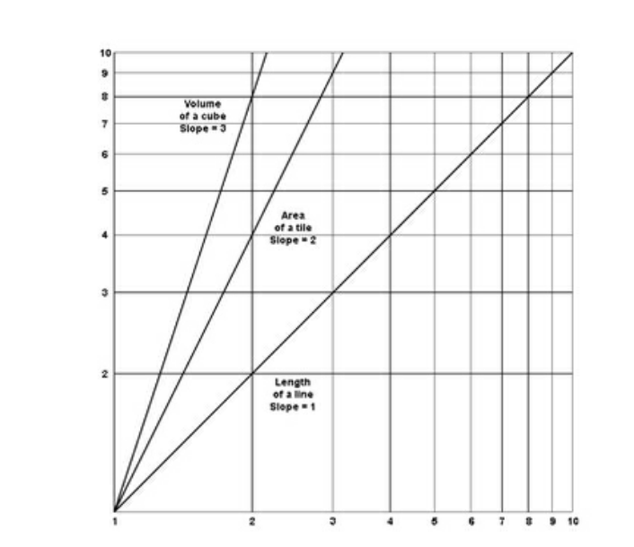
Above figure is a log-log graph with α equal to 1, 2 and 3. The figure is graphed by Mandelbrot and the center line shows the slope of a tile area to its side length relationship, which is similar to the chess square example.
Mathematical Distributions
The final touch to analyze cotton price came from the study of mathematical distributions. A stable distribution is robust when adding errors from two independent sources does not change the nature of the beast being analyzed. Sure, if you add the height of people from New York to an analysis of height in New Jersey, the average and variance height might change, but that change can be explained by the Gaussian normal distribution. However, as we identified earlier, the price of cotton follows a more skewed distribution, but thanks to the French Mathematician, Cauchy, the power law distribution is stable as well despite being more mathematically complicated. The difference between the Gaussian and cotton price distribution is that the former is egalitarian, while extreme data points dominate the latter. By that Mandelbrot means that adding another cotton price point might dominate the crowd, while adding the height of New Yorkers to a height analysis of New Jersians will not dictate the statistical outcome.
Figure 3
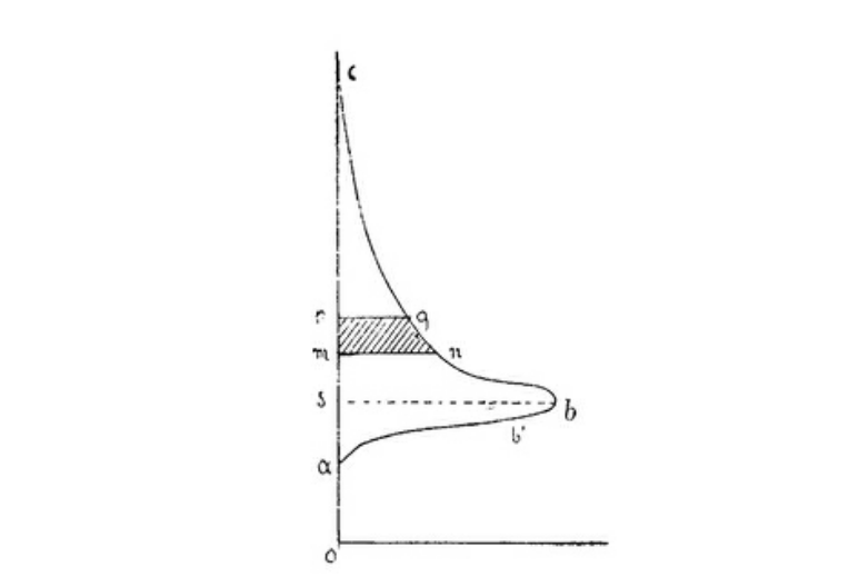
This graph depicts Pareto's income distribution result with rich people at the top and poor people at the bottom of the Y-axis and number of people at a given income level on the x-axis. Unlike the Gaussian bellcurve depicted in Figure 1, this picture demonstrates how skewed the income distribution is in reality. The top of the graph demonstrates the richest people in society, which is so far away from the mean that the Gaussian laws are unable to predict people that rich.
Putting It Together In Cotton Price
When Mandelbrot added new data points to his cotton analysis, the volatility floated between 0.4% and 3% instead of being constant. Adding new data points also included larger price jumps than the Gaussian model could explain. Mandelbrot thought that just like there are many poor people in the world and a few rich people, it seems like there are many small cotton price moves and a few extremely large ones. To test if price moves follows the power law, he needed to find the equivalent power to Pareto’s alpha of 3/2α. To complete his test, Mandelbrot graphed price moves on log-log paper and the plot was linear with a negative 1.7 slope, which displays the same pattern as the chessboard graph in Figure 4 This variation is slightly higher than Pareto’s 1.5α and slightly lower than a gamblers earnings from tossing a coin at 2.0α. Mandelbrot also showed that the pattern was time invariant meaning that prices showed an identical pattern across data with daily, monthly and yearly frequency. One can thus conclude that price variation of cotton is fractal! Daily prices behave like yearly prices and monthly prices like daily prices. Another conclusion drawn from Mandelbrot’s cotton research is that modern finance based on Gaussian statistics underestimates the likelihood of extreme events. Perhaps this underestimation is due to the fact that mass psychology has an enormous impact on finance markets when driven by fear.
Figure 4
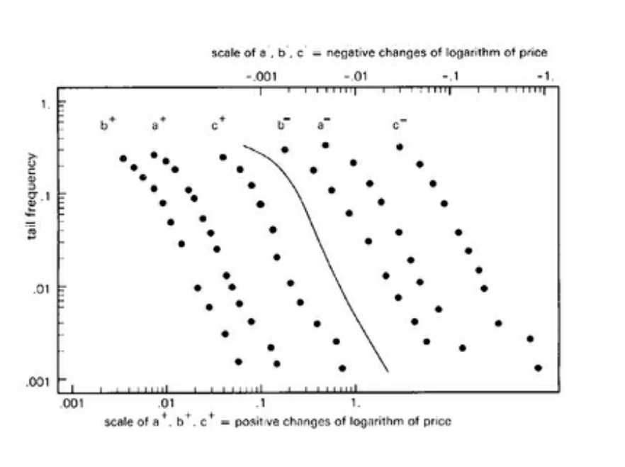
Figure 4 is a log-log depiction of cotton prices with positive and negative changes graphed separately. In this graph, Mandelbrot proves that cotton price swings are time invariant and that it follows a power law with a negative 1.7 slope. +- a, b, c shows daily variation over time periods (1900-1945), (1944-1958), (1888-1940) respectively with larger moves to the right on the horizontal axis. In practice, the sloping line is is not straight like in theory, but that is to be expected.
Adding Long-Term Dependence - H
If you flip a coin 100 times, Bachelier’s Gaussian model suggests that the range between the longest hot streak and losing streak varies with the square root of flips. If your best winning streak was 5 heads in a row and worst loosing streak was 3 tails, the range from best to worst was 8. For a game with 10,000 flips, assuming that each coin flip is independent, the Brownian Bachelier model infers that the range from best to worst compared to just 100 flips is square root 100 times greater, which results in a range of 80. However, unlike coin flipping, the fundamentals impacting asset prices such as inflation, unemployment and production are not independent events. Take the shut down of businesses across the U.S. amid the COVID-19 crisis as an example. This shutdown has caused an unemployment rate that is serially correlated, as around 30 million people have filed for unemployment in the first quarter of 2020. It is then possible that the sharp drop will have a long-term effect if people are unable to go back to work. One possible long-term consequence is that video conferencing might make traveling sales people redundant as meetings could take place via videoconference rather than booking expensive flights and hotel rooms. This in turn will have a severe future impact on the travel companies, hotel industry and economy. Long-term dependency can also take place in time series analysis. For example, the historical analysis of cotton price shows that asset prices can trend further than predicted by the Brownian square root of time law. Mandelbrot labeled this trending tendency “Fractional Brownian Motion” or so called long-term dependence “H” in honor of the hydrologist Harold Hurst and mathematician Ludwig Otto Holder. The value of H can be anywhere on a scale from 0 to 1. If a variable dependent on time tends to swing further than suggested by the Brownian law then the H is greater than 0.5 and the price trend is persistent. Perhaps this explains why human behavior generates price trends in markets such as equities. If prices went up yesterday it might give humans a false sense of confidence that this will occur again and they then extrapolate this pattern into the future by purchasing more stocks. This also explains why Hedge Funds running a trend following strategy generates a high risk adjusted return. However, as displayed by Pareto’s α, at any point the market can swing in the opposite direction and that is why risk management and running a diversified portfolio is so important in the investment industry.
Figure 5
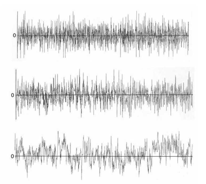
The middle graph shows the brownian motion value of a time series with H = 0.5. The top has an H < 0.5, while the bottom graph depict a time series with a persistent price trend of H > 0.5.
Bringing Together H and α
If α measures discontinuity of events and H measures long-term dependence then how do these factors impact the underlying variable such as cotton price? For H or long-term dependence to exist according to Mandelbrot, order of events matters. However, for α, order is not important as the discontinuity pattern depends on relative size of the event. To test how impactful the long-term dependence is on the underlying variable, one can shuffle the data used for forecasting like a stack of cards. After shuffling the data, the relative size of events will still be visible, but the order of events will change. If there is a large difference in result before and after the reshuffling, one can conclude that there is a form of long-term dependence impacting the underlying variable. In certain circumstances these two variability causing variables has a dual relationship such as in the tossing of a coin where H=0.5 and α = 2, which yields the Brownian relationship H=1/α. Mandelbrot does generally not believe this relationship holds true in markets, but the fact that variance relationships in the market guided by power laws and persistent trends exists defies the laws of Gaussian statistics.
Figure 6
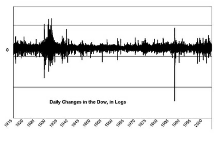
Using logarithms rescales everything so that a1% change in 1915 equals a 1% change in 2003. Two noteworthy changes here is the flash crash in 1987 and the clustered volatility during the Great Depression in 1929. These particular moves are way outside the scope of Gaussian statistics.
H And α In Practice
The existence of α and H also opens up the possibility of recurring anomalies in asset prices, which can be harvested by investors with a quantitative mindset. When it comes to evidence for α and H the results are varied. According to Mandelbrot, industrial heavy weights such as Alcoa and General Foods have values of the former closer to the Gaussian 2α, while more volatile high beta technology stocks are lower than cotton’s 1.7α meaning that the α distribution is more uneven than the Gaussian bell curve would suggest. Similar to α, the latter is also range bound with research suggesting a range of values from 0.5H to 0.63H for the USD relative to other currencies and a range of 0.53H to 0.74H for the S&P 500. Both of these H-ranges signals a higher persistency for trends than suggested by the random walk value of 0.5H. The lack of clear patterns in H and α among financial instruments means that more research needs to be done on fractal analysis to fully confirm Mandelbrot’s theory. Finally, if the markets are long-term dependent and follow power laws, they are much more risky than predicted by the Gaussian normal distribution. As an example, one can look at the historical equity risk premium, which according to the standard financial model should be around 1%. However, in practice, the equity risk premium ranges between 4-8%, which is much higher than the conventional theory’s 1%. This is because market participants either demand a higher compensation because markets are risky or they demand a higher compensation because they fear that markets are risky. The fear of financial ruin as suggested by conventional wisdom is a powerful force and explains why many investors prefer holding a sub optimal amount of investible assets in cash.
Mandelbrot is most famous for his work in fractal geometry. Above depicts the now famous Mandelbrot set. https://en.wikipedia.org/wiki/Mandelbrot_set
Conclusion
Bachelier brought Gaussian statistics to the financial world. Through his analysis of French bond prices based on assumptions such as normal distribution, price independence and stationarity, Bachelier influenced future orthodox financial economists such as Markowitz, Sharpe, Black and Scholes. These gentlemen went on to form foundational economic theories guiding investment decisions and risk taking that we see today. However, their elegant models are not always perfect and perhaps even dangerously flawed, as Gaussian statistics fails to incorporate the real risk of tail events, which definitely played a part in the creation of The Tech Bubble in 2001, The Great Financial Crisis in 2008 and the Corona Crisis in 2020. Mandelbrot formed a complementing theory to orthodox finance in his book, The Mispricing of Markets, which suggests a fractal approach attacking some of the underlying assumptions in Gaussian statistics. Unlike conventional theory suggests, Mandelbrot states that market prices are dependent sometimes creating persistent price trends according to the long-term dependence variable H. He also proves through his cotton price analysis that tail events occur more often than suggest by a normal distribution. In fact, Mandelbrot concludes that α in the power law guides market movements at the tail, although he realized that different markets seem to have varying value of α. Important to note is that his analysis of the cotton prices also demonstrated that the power law is time invariant meaning that large price moves over longer time are scaled smaller fractals over shorter time periods.
Well done!


Comments